Is your eCommerce store’s conversion rate stuck at a measly 2% while your competitors are crushing it at 10%? That’s not just a number—it’s thousands in lost revenue every single month.
Let’s fix that. This guide delivers battle-tested CRO testing ideas for eCommerce stores that actually move the needle (not just look pretty).
I’ve watched countless online retailers waste time on random button color tests while ignoring the conversion killers hiding in plain sight. The worst part? They never even realize why customers are abandoning their carts.
By the time you finish reading, you’ll know exactly which elements to test first—and why most stores get the testing sequence completely backward.
Understanding CRO Fundamentals for eCommerce Success
Key Metrics That Drive eCommerce Conversion Rates
Your eCommerce store could be getting tons of traffic, but if those visitors aren’t buying, what’s the point? Tracking the right metrics is how you’ll know if your store is actually making money or just looking pretty.
The conversion rate is your north star – the percentage of visitors who complete a purchase. The average hovers around 2-3% across industries, but top performers hit 5% or higher.
Beyond the basic conversion rate, pay attention to:
- Revenue per visitor (RPV): Often more telling than conversion rate alone
- Cart abandonment rate: If it’s over 70%, something’s broken in your checkout
- Average order value (AOV): Sometimes a small conversion rate with high AOV beats the reverse
- Product page bounce rates: High bounces = poor product presentation
- Time to purchase: Shorter isn’t always better, but extremely long paths signal friction
How to Establish a Data-Driven CRO Testing Framework
Nobody has unlimited time or resources. You need a system to prioritize tests that’ll actually move the needle.
Start with this simple framework:
- Gather evidence: Use analytics, heatmaps, session recordings, and customer feedback
- Identify patterns: Where are customers dropping off? What’s confusing them?
- Formulate hypotheses: “By changing X, we expect Y outcome because Z reason”
- Prioritize tests: Use the PIE method (Potential, Importance, Ease)
The most successful stores run 4+ tests per month. They know that losers teach you as much as winners.
Common Conversion Roadblocks in eCommerce Stores
The path from browser to buyer is full of potential pitfalls. These conversion killers show up repeatedly across eCommerce sites:
Checkout friction tops the list. Every extra field or step can cost you 10% of potential customers. Guest checkout isn’t optional anymore – it’s expected.
Poor product imagery is surprisingly deadly. Shoppers need to see products from multiple angles with zoom functionality. Single, low-quality images scream “unprofessional.”
Hidden shipping costs remain the #1 cause of cart abandonment. Nobody likes surprises at checkout.
Mobile experience gaps are increasingly costly. Over 60% of shoppers use mobile, but conversion rates on phones still lag behind desktop by 50%.
Trust signals (or lack thereof) make or break conversions. Missing reviews, security badges, and return policies leave customers wondering if you’re legitimate.
Fix these common roadblocks first before chasing fancy optimization tactics.
Product Page Optimization Strategies
A. Value Proposition Testing to Boost Purchase Intent
Product pages that convert don’t just show items—they make irresistible promises. Your value proposition is that promise, and tweaking it can dramatically lift conversions.
Try testing these variations:
- Problem-solution framing: “Never worry about dead batteries again”
- Benefit-focused messaging: “Fall asleep 45% faster”
- Exclusivity angles: “Handcrafted in small batches”
The magic happens when you match your value prop to what your visitors actually care about. One eCommerce brand saw a 41% conversion increase just by changing “Professional-grade tools” to “Tools that work as hard as you do.”
Don’t guess—test these elements:
- Headline variations
- Bullet point formats (features vs. benefits)
- Button text that reinforces the value prop
B. Product Image and Video Variations That Convert
Pictures sell products. Period. But not all visuals perform equally.
Test these proven winners:
- 360° product views (increased conversions by 27% for an outdoor gear retailer)
- Real people using your products vs. plain product shots
- Before/after demonstrations
- Multiple angles vs. single hero shot
Videos are conversion powerhouses too. A clothing retailer saw 85% higher conversion rates when adding product videos showing how items fit on different body types.
Quick test ideas:
- Short vs. long videos
- Sound on/off by default
- Auto-play vs. click-to-play
- Lifestyle footage vs. product demonstrations
C. Price Presentation and Discount Display Tests
The way you present pricing can be the difference between “add to cart” and “maybe later.”
Test these price presentation tactics:
- Anchoring with original prices ($149 $99)
- Emphasizing monthly payments over full price
- Bundle pricing vs. individual pricing
- Highlighting per-use cost (“Just $1.50 per wash”)
Discount displays deserve their own testing strategy:
- Percentage off vs. dollar amount off
- Time-limited offers with countdown timers
- Free shipping thresholds
- Bulk discounts vs. loyalty points
A subscription box company increased average order value 15% by switching from “20% off” to “Save $24” on annual plans.
D. Social Proof Placement for Maximum Impact
People trust other people more than they trust your marketing. But where you place that trust-building social proof matters.
Test these placements:
- Reviews next to the add-to-cart button
- Star ratings in product thumbnails
- Customer photos above product description
- Real-time purchase notifications
Beyond basic reviews, test these social proof formats:
- Expert endorsements vs. customer testimonials
- Video testimonials vs. written reviews
- Number of purchasers (“2,458 people bought this”)
- Celebrity/influencer usage evidence
An electronics store saw 18% higher conversions placing verified purchase badges directly beside reviews instead of at the top of the review section.
E. Cross-Sell and Upsell Element Optimization
Smart recommendations can boost average order value by 10-30%, but only when done right.
Test these cross-sell strategies:
- “Frequently bought together” vs. “Customers also viewed”
- Complementary items vs. similar alternatives
- Bundled discounts vs. separate recommendations
- Number of suggested products (3 vs. 5 vs. 8)
The placement timing matters too:
- Pre-purchase recommendations
- In-cart suggestions
- Post-add-to-cart modal popups
- Post-purchase email recommendations
A beauty retailer increased cart value by 22% by showing “Complete your routine” product bundles instead of “You might also like” individual items.
Checkout Flow Improvements

A. Cart Abandonment Reduction Techniques
Ever noticed how many shoppers bail at checkout? The average cart abandonment rate hovers around 70%. Yikes.
Here’s what actually works to keep customers moving forward:
- Exit-intent popups – Test offering a small discount right when someone’s about to leave
- Abandoned cart emails – A series of 3 emails works better than just one
- Progress indicators – Show exactly how close they are to finishing
- Save cart functionality – Let them come back later without starting over
Test removing surprise costs too. Nothing kills conversions faster than unexpected shipping fees or taxes appearing at the last step.
B. Multi-Step vs. One-Page Checkout Testing
The debate rages on: multi-step or one-page checkout?
Multi-step checkouts break the process into digestible chunks. One-page checkouts put everything in front of the customer at once.
I’ve seen both work brilliantly and fail miserably. It depends on your specific audience and products.
Test these variations:
- 3-step process vs. 2-step process
- Accordion-style forms that expand as you complete each section
- Progress bars with different messaging
- One-page with collapsible sections
Mobile users typically prefer fewer steps with larger, easier-to-tap fields.
C. Guest Checkout Optimization Opportunities
Forcing account creation is the checkout killer.
80% of shoppers hate creating accounts. But you need customer data. The solution? Make guest checkout the prominent option, then offer account creation after purchase.
Test these approaches:
- Social login options (which ones work best for your audience?)
- Email-only checkout (just an email, nothing else)
- Post-purchase account creation with clear benefits
- “Save your info for faster checkout next time” instead of “Create an account”
D. Trust Signal Placement for Transaction Confidence
The moment of truth – entering payment info – is when doubt creeps in.
Strategic trust signal placement can squash those concerns:
- Test security badges directly next to credit card fields, not just in the footer
- Add customer review snippets on the payment page
- Display real-time inventory status (“12 others have this in their cart”)
- Include money-back guarantee messaging near the final button
- Show accepted payment methods prominently
Microcopy matters too. Test phrases like “Your information is secure” vs “256-bit encryption protects your data” to see which builds more confidence.
Mobile-Specific CRO Tactics
Mobile Navigation and Filter Improvements
Mobile shoppers hate clunky navigation. Period.
Test these navigation improvements and watch your conversion rates climb:
- Sticky headers that keep menu options visible while scrolling
- Hamburger menu variations (different icons, placements, or animations)
- Simplified category structures with fewer taps to reach products
- Advanced filter positioning (top vs. bottom drawer vs. slide-in panel)
- Search bar prominence and placement (persistent vs. collapsible)
One eCommerce site saw a 31% increase in mobile conversions after replacing their traditional dropdown categories with an expandable accordion menu. The key was reducing cognitive load – when shoppers can find products faster, they buy more.
Touch-Friendly Button and Form Field Tests
Ever tried hitting a tiny checkout button with your thumb? Frustrating, right?
Mobile users navigate with fingers, not mouse pointers. Test these elements:
- Button size and spacing (minimum 44x44px touch targets)
- Form field height and auto-fill capabilities
- Input mask formatting for phone/credit card numbers
- Inline validation vs. submit-time validation
- Single-column vs. multi-column form layouts
One clothing retailer increased their mobile conversion rate by 17% simply by increasing button sizes and spacing them further apart. Sometimes the simplest changes drive the biggest results.
Mobile Payment Method Optimization
Mobile payment friction kills conversions faster than anything else.
Test these payment optimizations:
- One-click purchasing options
- Digital wallet prominence (Apple Pay, Google Pay)
- Guest checkout vs. account creation flows
- Payment method order and visibility
- Save payment details behind biometric authentication
The stats don’t lie – stores offering digital wallet options see 23% higher conversion rates on mobile compared to those with traditional checkout only.
Mobile-First Product Display Experiments
Your product images and info need to shine on small screens.
Test these mobile display elements:
- Image gallery navigation (swipe vs. dots vs. thumbnails)
- Zoom functionality (pinch vs. double-tap vs. slider)
- Sticky “Add to Cart” buttons while scrolling product details
- Collapsible vs. tabbed product information
- Social proof placement (reviews above the fold or below?)
Mobile users make faster decisions than desktop shoppers. A fashion brand found that putting their size guide in an easily accessible slide-up panel (rather than a separate page) reduced abandonment rates by 24%.
Don’t make mobile users work for information they need to convert.
Landing Page and Category Page Tests

Hero Section Variations That Capture Attention
Your hero section is prime real estate. It’s the first thing shoppers see, and you’ve got about 3 seconds to make an impression.
Try testing these hero section variations:
- Value proposition focus vs. product showcase – Does highlighting your unique selling point outperform showing your best-selling products?
- Static image vs. carousel vs. video background – Video might seem flashy, but sometimes a single powerful image converts better.
- CTA button placement and wording – “Shop Now” is boring. Test “Find Your Perfect [Product]” or “See What’s New” against your standard CTAs.
One eCommerce client of mine saw a 24% conversion lift just by changing their hero image to show their product being used by real people instead of a plain product shot. The emotional connection matters.
Category Layout and Sorting Option Tests
The way products are organized can make or break your conversion rate. Some tests worth running:
- Default sorting options – Test “Best Sellers” against “New Arrivals” as your default sort.
- Number of products per row – 3, 4, or 5 products across? It depends on your product visuals.
- Category description placement – Above products or below? Many stores bury valuable SEO content where no one sees it.
One fascinating insight: adding a simple “Recommended for You” section at the top of category pages increased average order value by 16% for a fashion retailer I worked with.
Filter Functionality Improvements
Filters are the unsung heroes of eCommerce navigation. When was the last time you tested yours?
Test these filter improvements:
- Multi-select vs. single-select filters – Let customers choose multiple options within a filter category.
- Visual filters for color/style – Image swatches outperform text-only filters for visual attributes.
- Mobile filter visibility – Test prominent “Filter” buttons against expandable accordion-style filters.
The most impactful filter test I’ve seen? Adding a “In Stock & Ready to Ship” filter option increased conversion rate by 8% overnight for a furniture retailer. Customers hate waiting.
Product Grid vs. List View Performance
Grid view dominates eCommerce, but is it always better? The answer: it depends on your products.
Run these view tests:
- Default view setting – Which performs better as your default: grid or list?
- Product information density – Minimal info (just name/price) vs. feature highlights in grid view.
- Image size variations – Larger images with fewer per row vs. smaller images with more products visible.
Complex products with multiple features (like electronics) often convert better in list view where you can showcase specs. Simple visual products (like fashion) typically perform better in grid view. But don’t assume – test it!
Search Functionality Optimization

Search Bar Visibility and Placement Tests
Your search bar might be the most underrated element on your entire store. Think about it – customers who use search are actively telling you what they want to buy!
Testing shows that search users convert at 1.8x the rate of regular browsers. That’s too big to ignore.
Try these tests:
- Move your search bar to the center of your header instead of tucked away in a corner
- Increase the size by 20-30% to make it more prominent
- Test a contrasting color that pops against your site design
- Add the word “Search…” as placeholder text vs. using just a magnifying glass icon
One eCommerce client saw a 14% lift in search usage just by moving their search bar from the right corner to center-top position. More searches = more sales.
Autocomplete and Predictive Search Improvements
The difference between basic and advanced search functionality is like night and day.
When customers type, are you helping them find what they want faster?
Test these improvements:
- Show product thumbnails in the dropdown suggestions
- Display prices right in the autocomplete results
- Prioritize bestsellers at the top of suggestions
- Include category matches along with product matches
- Test typo tolerance (“jaket” still shows “jacket” results)
Brands that implement image thumbnails in search suggestions see up to 10% higher conversion rates from search users.
Search Results Page Layout Optimization
Your search results page is mission-critical. It’s where customers who know what they want decide if you have it.
Run these tests:
- Grid view vs. list view as the default display
- Number of products per row (3 vs. 4 vs. 5)
- Showing filters prominently on left vs. collapsible at the top
- Adding “Add to Cart” buttons directly on search results
- Highlighting sale items with badges or color indicators
The most effective search results pages make filtering intuitive. 72% of users will abandon if they can’t quickly narrow down options.
A well-optimized search results page can increase conversion rates by 15-30% compared to basic implementations. That’s real money left on the table.
Conclusion
Optimizing your eCommerce store through strategic CRO testing can dramatically improve your conversion rates and revenue. From refining product pages with better images and compelling copy to streamlining your checkout process and enhancing mobile experiences, each optimization area presents valuable opportunities to reduce friction and guide customers toward purchase. Category page layouts, landing page designs, and search functionality improvements further contribute to creating a seamless shopping journey for your customers.
Remember that successful CRO is an ongoing process rather than a one-time effort. Start by implementing one or two of these testing ideas and measure their impact before moving on to others. By continuously testing, analyzing results, and refining your approach, you’ll build an eCommerce store that not only attracts visitors but efficiently converts them into loyal customers.
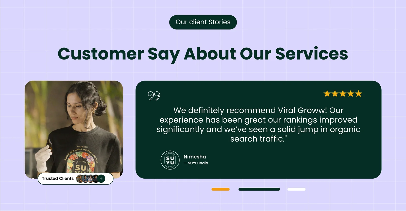
How We 2.5X’d Organic Traffic for SUYU India in Just 5 Months by Following Our White Hat SEO Framework
SUYU India was born with a clear vision—to bring superfood-powered skincare into the Indian market. Co-founded with a deep belief in sustainability.
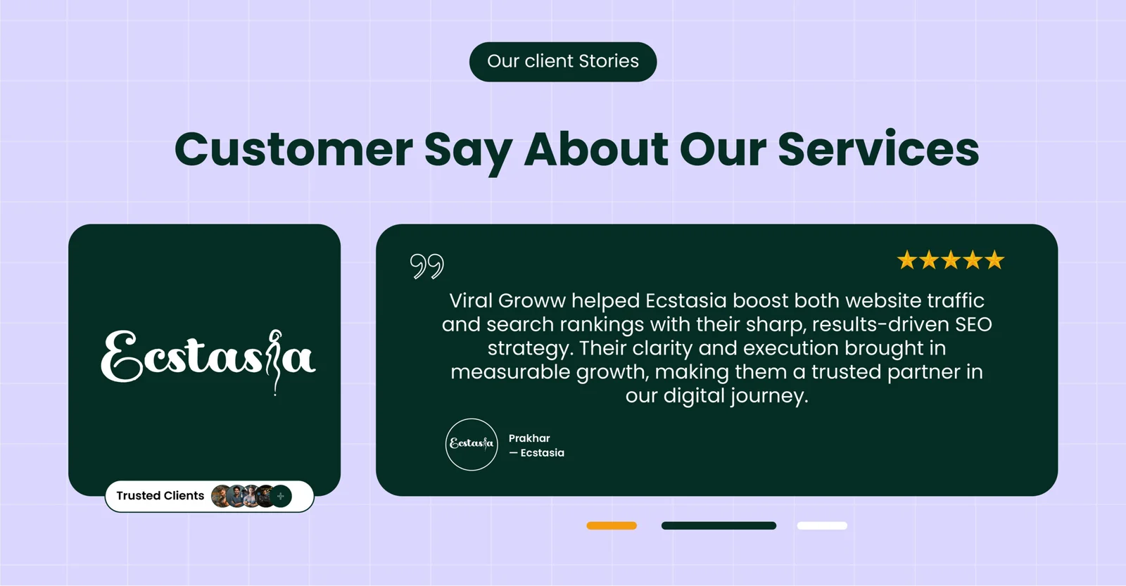
Scaling a Sexual Wellness Brand with SEO – How We Did It for Ecstasia
Ecstasia is a sexual wellness D2C brand started by Prakhar Raj and Hamid Iqbal in December 2024. Prakhar, a school friend of mine, works in a corporate job but has always wanted to start his own business.
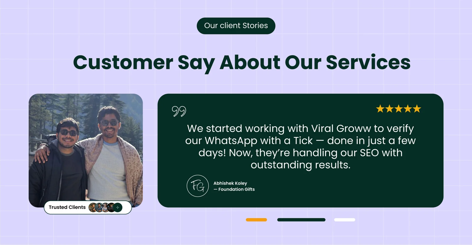
How we got 8.7X Impressions for a gifting D2C brand within 3 Months by doing White Hat SEO
Foundation Gift was started by Rakesh Adak and Abhishek Koley with a simple idea — gifts should feel just as special as the moments they celebrate.
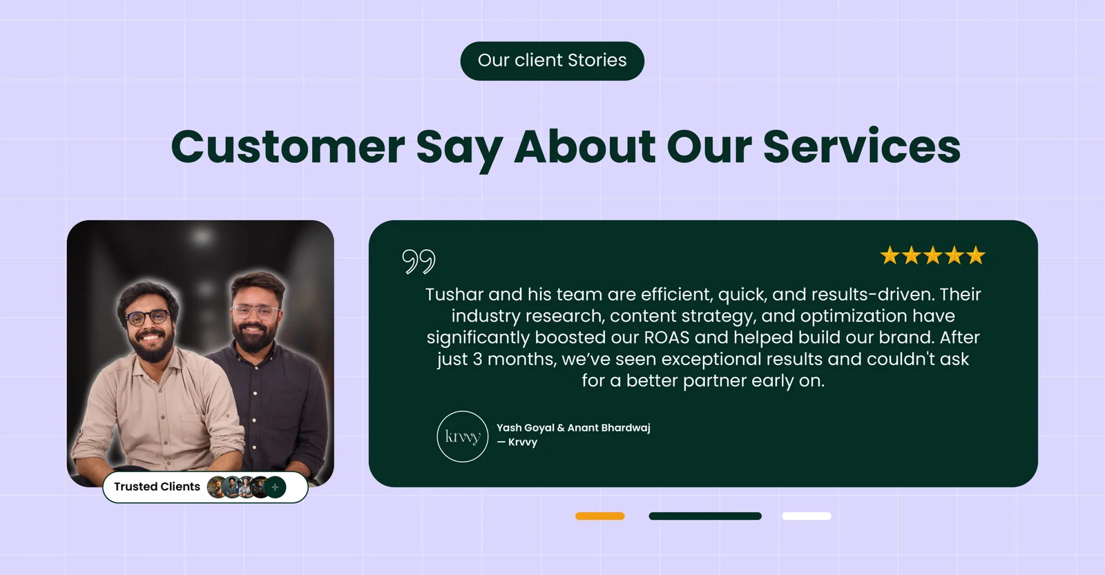
Scaling a Lingerie Brand to 7-Figure Sales in Just 75 Days—Proof Inside!
Krvvy is a modern, forward-thinking lingerie brand committed to redefining comfort and functionality. Designed to elevate the lingerie experience, Krvvy celebrates the beauty of all women, embracing and admiring every curve.
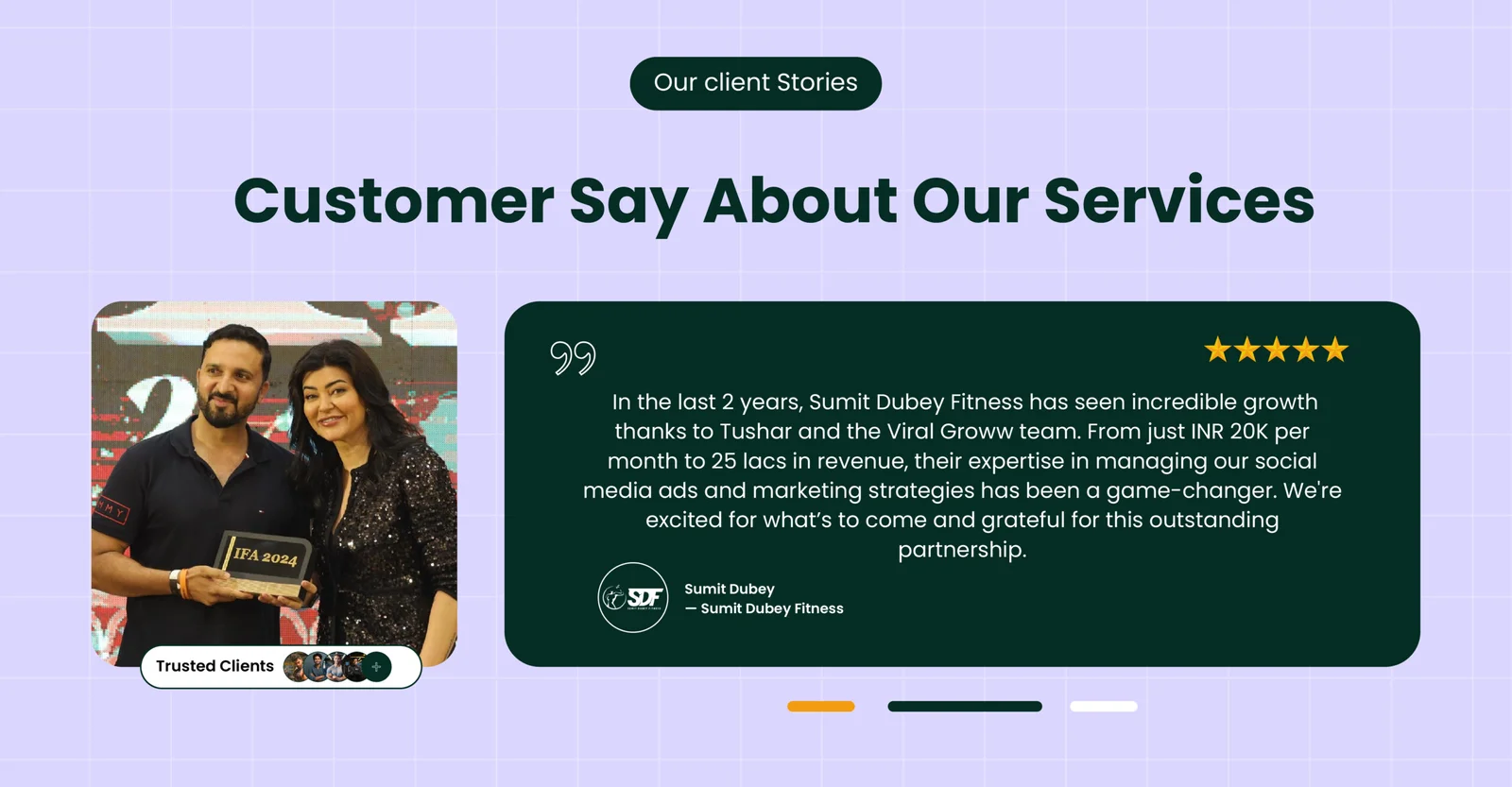
How Sumit Dubey Fitness Classes Transformed into a Fitness Empire with Strategic Digital Marketing
Sumit Dubey Fitness Classes, founded by Sumit Dubey, provides online fitness training with a personalized touch.

Raj Yoga School’s Journey to the Top of Search Rankings
Nestled between the tranquil peaks of the Himalayas and the sun-kissed beaches of Goa, Raj Yoga School has been a sanctuary for aspiring yoga teachers in India.
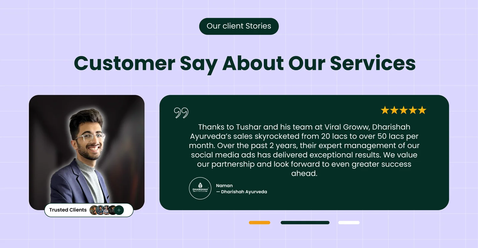
Scaling Dharishah Ayurveda from ₹20 Lakhs to ₹50 Lakhs in Monthly Sales
Dharishah Ayurveda, a promising Ayurvedic brand, had already seen growth through performance marketing, scaling from ₹2 lakhs to ₹20 lakhs in monthly sales (covered in a previous case study).
Building Trust and Revenue for Dharishah Ayurveda with Scalable Facebook Ads
Dharishah Ayurveda, led by CEO Naman Dhamija, is a premium Ayurvedic brand dedicated to promoting natural wellness.
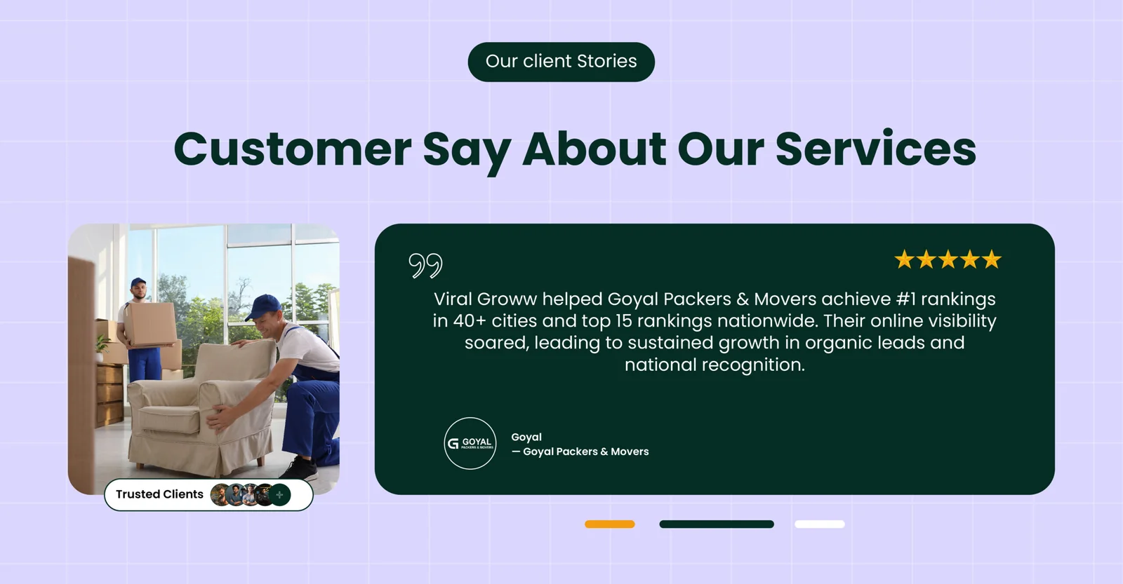
How Goyal Packers & Movers Skyrocketed to #1 in 40+ Cities with White Hat SEO
Goyal Packers and Movers India, owned by Mr. Sampat Singh, is one of the most preferred packers and movers across Northern India, offering exceptional shifting services.